Throughout my print productions there is a visual link through the background image of the sky. The image is composed so that the skyline runs just below the middle of the frame. This allows for the deep blues at the top to be shown. I also used the same font throughout but on the front and back panels it was capitalised as they are the first two that will be seen so I can draw in an audience. The inside panels used lowercase fonts to appear soft, matching the synth genre which is inspired by Chvrches' "soft" noise. I also placed some lyrics from the song in the inside panels so the two inside panels are visually linked through the use of lyrics. I also have a recurring motif of physical manipulation across all 4 panels. The front and back have the same effect of pixel dispersion to show identity fragmentation. The inside two are juxtaposing ideas as smoke is from fire and the other panel is water. This juxtaposition is executed in order to show inner conflict as the character on the front are the same but different effects. This shows how young people are constantly struggling with themselves as they are always conflicting. The recurring motif of physical manipulation links to the indiesynth genre because the sound the synthesisers creates are computer generated, hence linking to the pixels. The fantasy element of the reality distortion is seen in the music video as the reverse part of the music video is physically not possible. The reversed ping pong shots are an example of the reality distortion as the ball goes back and forth on the table, showing the cyclic structure of house parties and therefore fitting into our cyclic narrative.
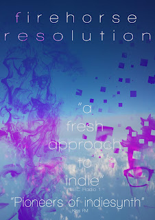
There is a clear link to my other print productions in my magazine advert brought about by the colour scheme, font and effects used. This is done to create a brand for the band as the concepts on each production uses a conceptual idea such as smoke, pixels or water. In the magazine I placed both the same characters on the cover both looking away from the cover. I decided to mix the pixel and smoke effect in order to create juxtaposition between old (smoke) and new (pixels and technology). This juxtaposition is done in order to represent youth as in turmoil and at war with itself. Youth today is criticised so harshly and should find solace within other youth and yet there is anger toward each other. This juxtaposition highlights the arguing sides of youth and the use of the smoke and pixel dispersion shows how youth is losing itself. Youth is fading and becoming fragmented which relates too the ancillary texts as the themes are the same. The thematic link is loss of youth's identity as it is becoming fragmented. This is shown in the music video through the deconstruction of stereotypes as the deconstruction shows how the characters are fragmented as they adopt different stereotypes (e,g preppy character losing the quiet disposition and gaining an argumentative and hostile disposition).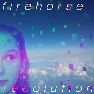
In this panel of the album I applied a gradient over the top so it would appear pink and the gradient then allowed there to be some green pixels. This is done to create a visual link as all of my productions use a pink and green colour scheme. The colour scheme is chosen as it fits with the blues in the background to create a somewhat fantasy-theme across the print productions. The fantasy theme is recurring as I used a smoke and water effect which have connotations of fantasy. This therefore is an inter-textual link to films such as Alice in Wonderland and The NeverEnding story. The fantasy theme is shown once again through the green, blue and pink colour scheme too. The mix of blue. pink and green has connotations of fantasy The character is also looking away from camera and this suggests she is guilty. The direction she is looking also is the same direction as the pixel dispersion effect which shows how youth lose themselves when they lie.
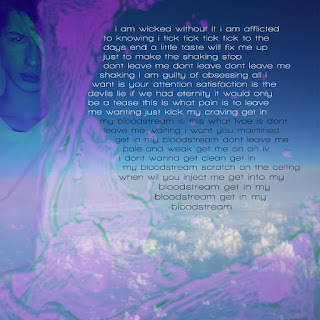 The first inside panel uses a water effect which is used to present youth's identities as fluid and unpredictable, just like water is. The pink colour is a visual link to the other texts however I decided to just focus on the pink colour as it allowed the water to blend to the character easier. It also allowed me to create a juxtaposition between the two inside panels as the second inside panel is mainly green. This is done as the back cover character is the same as the two inside. However, the inside character is wearing black and white, representing duality and conscience of youth. The white represents good and the black represents bad on the costume and font colour. This splits the two sides of the character into pink and green; black and white. This duality represents youth as having complex identities made up of good and bad. This therefore thematically links to the music video as we have positive and negative representations. The reality distortion is generally interesting and links to the other panels as the target audience are unconventional and will be interested in the panels. This panel is the panel which links most to the music video as the water effect reflect the alcohol in the music video and how it is becoming part of the characters. The alcohol has began to become a large part of them, changing their identities.
 |
| The apparition effect in the Harry Potter films |
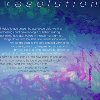 The third inside panel uses a similar colour scheme to the others but I enhanced the green colour in the smoke. The smoke is green to juxtapose with panel 2 but also to represent the loss of one's self. The back cover character is the same as this character and the colour scheme is a mix of pink and green. In this panel the actual character is mainly pink but the smoke is partly green, showing the loss of half of his identity; once again representing youth as fragmented in identity which thematically links to the ancillary texts. The text is relevant to the image as the adjective "invisible" reflects the character disappearing into smoke. The smoke is symbolic of the slow and gradual loss of identity at parties. The panel links to the music video as it shows identities being lost and as the character can see himself disappearing it reflects the main character watching other people lose their own identities. The smoke dissipation was originally inspired by the apparition effect in the Harry Potter films. The smokey effect suited my theme and as Harry Potter is a fantasy film it works well. The effect I created mimics the apparition effect in the film as the character on the cover looks as though he is disappearing in smoke. I chose to place the lyrics to a song in the space as it is a convention of the genre to have lyrics to the band's song, creating a band image.
 This is my back cover. The overlaid effect on the character is a mix of pink and green and the pixel effect shows a separation of the pink and green colours. This links to my ancillary texts by visuals and links to my music video thematically by the fragmentation of youth's identity representation. Also, the character used is the same as the preppy character in the music video and therefore there is a link. Also, there is a generic link as there's a connection between the visual effect and album cover. The album is called "resolution" and the pixels reflect the title. The song title "nimbus" also reflects the background image of the sky as nimbus is a type of cloud, creating a visual link across all 5 print productions. The language used for the song titles all relate to the music video themes or album art. For example, 'Focus' has connotations of photography and clear pictures which is juxtaposed by the pixels, showing how youth's focus is not complete and is not seeing the full picture.
Well done for carefully exploring the link between your print productions, but you could do with looking at the link between the print productions and the music video. Also... what's a preppy character? Can you use standard English?? Finally, look again at your intro - the first sentence in particular is confusing!!
ReplyDelete