Thursday 23 March 2017

Question 3- What have you learned from audience feedback?

I collected data using Toluna QuickSurveys. I chose this online questionnaire tool because it was quick and simple to use. It also gave me many options when creating the survey for questions types such as multiple choice, rating and ordered answers. The process was easy as I emailed my questionnaire to 25 people who were my target audience in age and I have 10 questions which were:

1) How old are you?
These were the replies- 15% were 19-22 and 85% were 15-18.  This is ideal as my target audience is aged 15-24 so I have data which has been sent to the correct demographic.


2) What's your preferred genre of music?
This question allowed me to see what genre the age range prefer so I can narrow down whose going to enjoy the video most. 35% prefer indie and 15% prefer pop which is good as that means 50% of people would enjoy the song as it is a hybrid of indie, synth and pop.


3) Upon watching the music video what would you score the overall enjoyment?
This question allowed me to see how entertaining the video was as the main purpose is to entertain the audience in order for them to stay interested to hear the song. The average rating was 8.1 which is reasonable and shows that it is somewhat popular with the demographic. The themes were tailored towards the age demographic and therefore may be a reason for the scores. The lowest score received was 6 and the highest was 10 showing that there are things to improve upon.


4) What is your reasoning for your score to question 3?
A comment for question 4
This question allows me to gain qualitative data as all data I have so far is quantitative data.


Question 5) Were you able to interpret a narrative?
This question simply allowed me to understand how understandable the narrative was. This feedback has shown me that 50% of people could not interpret a clear narrative but the narrative was able to be seen. 35% of the audience understood the narrative which shows that our narrative was fairly readable but there were some problems in terms of communicating it.

Question 6) What is your reasoning to question 5?


This question was important as it allowed me to find out why people could or could not understand the narrative. The comment on the right highlights the main problem with the music video which is the issue of conveying the narrative.


Question 7) Sort album covers by effectiveness (1= strongest)
This question allowed me to see which cover was the best one in the audience's opinion. The data found shows that (on an average) the strongest is panel 1, then panel 2, then panel 3 and then panel 4. The graph splits the ratings up and you can see which ones are the strongest. Panel 2 and 3 were similar in effectiveness. Panel 1 is clearly the most popular whereas panel 4 is the least popular as 50% of people rated it the weakest. 45% of people rated panel 1 the strongest.


Question 8) Do you think the music video appears professional and why?
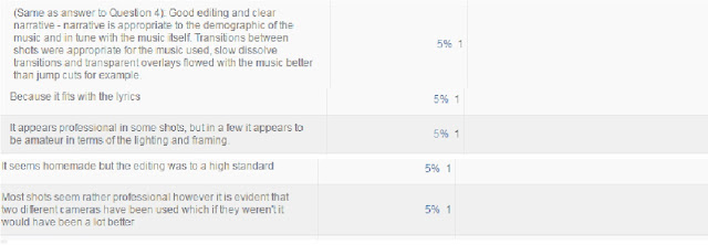
This question allows me to see what the audience thinks in terms of production value. I knew that the replies may be negative as we only had access to school equipment and were therefore limited in terms of production value and camera quality.  The comments below give some good insight into what was wrong and right about it. The editing seems to be praised the most however the main problem is the camera quality as it is very clear that we used two different cameras. After this feedback I would use one camera to create consistent quality.


 Question 9) Do you think the album covers seem professional? Why?
This question allows me to gain feedback on the audience on my editing and designs for album covers. On a whole the feedback is very positive however there were two comments which disagree completely, stating it seemed unprofessional. This is something I could not help as I have not used Photoshop before this year and tried to make them appear as professional as possible.


10) If you saw the magazine advert would you buy the album?
This question can evaluate my advert and how well it advertises the band. It uses a similar design as the album covers and the comments are rather mixed. The fifth comment is positive as an advert should be eye catching. The second album is the best comment received as it shows the audience sees exactly what I wanted to convey which was the brand and music genre.


My entire data set is made up of people who fit our demographic so I know that all the data I have is representative of the demographic. This makes my results valid as I know that the feedback will be from the correct demographic I want. Also, the gender ratios were rather similar. 45% were male, 55% were female. This is good because I have an equal amount of data for the sets however the data sets are biased as they were not random. I used an opportunity sample and sent the email to people who I knew would provide me with data I could use and data that I would receive back quickly. 


The main issue with my narrative is that it came off as unreadable and confusing. There are some ways I could have tried to make it more understandable would be to just focus on one narrative instead of using an interweaving one. In indie genres the narratives used are often simple narratives however we used a multi-stranded interweaving narrative which can be confusing for first time viewers. 

Strengths from feedback

My feedback provided me with an opportunity to see what was done well. One thing I noticed was that although the specific narratives were not fully understood, there was recognition of the multiple narratives we had. This shows that we used an effective way of weaving in smaller narratives into our music video. 
Another strength was that my print productions were rather effective. The advert, front cover and panel 3 (smoke panel) received praise and was described as "eye-catching". This tells me that those print productions were effective. The panels were described as creative and had an interesting design and intrigued the audience.
One comment gave positive feedback on the print production concept which means that the concept works and is communicable to the audience. A similar comment from an indie-genre fan said they would look into buying the album. The consistency of design created a brand which the audience seemed to like.

Weaknesses from feedback

The narrative was said to be confusing and therefore it does not convey the message we intended to convey. The different narratives became confusing for some and all that was seen was a party scene.
Another weakness from the feedback was that my back cover was very weak. There was criticism towards the image editing as it was stretched and cropped poorly. As well as this 50% of people rated it as the weakest which highlights a weakness of my print productions, showing me where I have caused an issue with consistency as it is not the same quality as the others. 
There were some comments which stated the album covers came across as "confusing" as "there was too much going on". This tells me that some of the panels were too busy in terms of effects. However, I also received a comment where I was told the album covers were too simple and not creative enough so I know that I am in between so I can compromise. 


Stuart Hall's Reception Theory

I received comments on my music video which stated my music video was too confusing, boring or bizarre. I also received comments that understood the narrative and praised the video. This mixture of comments links to Stuart Hall's reception theory. His theory states that an audience member's interpretation and reception is determined at the point of consumption. When planning and creating the video we naturally placed ourselves in the situation of the protagonist and therefore had not considered how other people from different backgrounds would view the music video. People always try to sympathise with a music video and place themselves in it and their way of understanding is shaped by their own experiences with the event. Hall made 3 "reading" types which were the Preferred reading (the intended reading by the creator and in this case the intended reading was to elicit the danger in house parties that youth create for themselves and how youth is becoming fragmented), negotiated (some is understood, some is not) and oppositional (the reading is completely misunderstood) readings. 

Hall's theory may be an explanation for the different types of comments. If an indie fan watched the video they may understand it more than if a R'n'B fan would as the two genres have two different music video conventions. 
Also, a person's schema would affect how they read the music video. A person's personal experiences affect how they understand new ones so if someone had not seen a multi-stranded narrative video before they would not understand it very well.

Extra Feedback

Throughout the construction of the productions I received feedback from my teacher and my friends. On my music video we received a lot of feedback in terms of pace. Our music video initially had little climax to match the song and so we changed it by increasing shots per second as the song becomes louder and faster. We also did not plan of having artist shots in the music video at all but after creating the video with no artist shots it lacked something that would brand it. We therefore shot an artist shot which we cut into the video to make it appear more indie as our video is influenced by Chvrches' video for "Mother we Share" which has artist shots. This made the music video more effective and more readable too.
We also received feedback from friends. This feedback was helpful as our friends are in the same target age demographic so we could see their opinions and change what we had to. For example, the balloon shots and sliding bottle shots (on the right) were added in as they were aesthetically pleasing to the people we showed them to.

Conclusion

Overall I have learnt that the fourth panel was the weakest and should have been made to follow the quality of the other 3 panels. I also learnt that the music video was difficult to understand for everyone .Although most people understood the narrative there was still a large portion which was left confused to what was happening.

Question 2- How effective is the combination of your main product with ancillary texts?

The generic link between my music video and print productions is they are all conceptual ideas which is a trait of the indie-synth genre. Chvrches also use conceptual ideas and that is why I chose to also use conceptual ideas. My print production all have the same background and same motif of physical manipulation such as the pixel dispersion effect and water effect. I chose to do this because I can display a message a lot easier through physical manipulative effects on Photoshop. The smoke for example explicitly shows someone fading away and the pixel effect shows someone quite literally being fragmented.

Throughout my print productions there is a visual link through the background image of the sky. The image is composed so that the skyline runs just below the middle of the frame. This allows for the deep blues at the top to be shown. I also used the same font throughout but on the front and back panels it was capitalised as they are the first two that will be seen so I can draw in an audience. The inside panels used lowercase fonts to appear soft, matching the synth genre which is inspired by Chvrches' "soft" noise. I also placed some lyrics from the song in the inside panels so the two inside panels are visually linked through the use of lyrics. I also have a recurring motif of physical manipulation across all 4 panels. The front and back have the same effect of pixel dispersion to show identity fragmentation. The inside two are juxtaposing ideas as smoke is from fire and the other panel is water. This juxtaposition is executed in order to show inner conflict as the character on the front are the same but different effects. This shows how young people are constantly struggling with themselves as they are always conflicting. The recurring motif of physical manipulation links to the indiesynth genre because the sound the synthesisers creates are computer generated, hence linking to the pixels. The fantasy element of the reality distortion is seen in the music video as the reverse part of the music video is physically not possible. The reversed ping pong shots are an example of the reality distortion as the ball goes back and forth on the table, showing the cyclic structure of house parties and therefore fitting into our cyclic narrative.
Shot of the ping pong ball
which goes back and forth,
showing the reality distortion
 There is a clear link to my other print productions in my magazine advert brought about by the colour scheme, font and effects used. This is done to create a brand for the band as the concepts on each production uses a conceptual idea such as smoke, pixels or water. In the magazine I placed both the same characters on the cover both looking away from the cover. I decided to mix the pixel and smoke effect in order to create juxtaposition between old (smoke) and new (pixels and technology). This juxtaposition is done in order to represent youth as in turmoil and at war with itself. Youth today is criticised so harshly and should find solace within other youth and yet there is anger toward each other. This juxtaposition highlights the arguing sides of youth and the use of the smoke and pixel dispersion shows how youth is losing itself. Youth is fading and becoming fragmented which relates too the ancillary texts as the themes are the same. The thematic link is loss of youth's identity as it is becoming fragmented. This is shown in the music video through the deconstruction of stereotypes as the deconstruction shows how the characters are fragmented as they adopt different stereotypes (e,g preppy character losing the quiet disposition and gaining an argumentative and hostile disposition).


 In this panel of the album I applied a gradient over the top so it would appear pink and the gradient then allowed there to be some green pixels. This is done to create a visual link as all of my productions use a pink and green colour scheme. The colour scheme is chosen as it fits with the blues in the background to create a somewhat fantasy-theme across the print productions. The fantasy theme is recurring as I used a smoke and water effect which have connotations of fantasy. This therefore is an inter-textual link to films such as Alice in Wonderland and The NeverEnding story. The fantasy theme is shown once again through the green, blue and pink colour scheme too. The mix of blue. pink and green has connotations of fantasy  The character is also looking away from camera and this suggests she is guilty. The direction she is looking also is the same direction as the pixel dispersion effect which shows how youth lose themselves when they lie.

The first inside panel uses a water effect which is used to present youth's identities as fluid and unpredictable, just like water is. The pink colour is a visual link to the other texts however I decided to just focus on the pink colour as it allowed the water to blend to the character easier. It also allowed me to create a juxtaposition between the two inside panels as the second inside panel is mainly green. This is done as the back cover character is the same as the two inside. However, the inside character is wearing black and white, representing duality and conscience of youth. The white represents good and the black represents bad on the costume and font colour. This splits the two sides of the character into pink and green; black and white. This duality represents youth as having complex identities made up of good and bad. This therefore thematically links to the music video as we have positive and negative representations. The reality distortion is generally interesting and links to the other panels as the target audience are unconventional and will be interested in the panels. This panel is the panel which links most to the music video as the water effect reflect the alcohol in the music video and how it is becoming part of the characters. The alcohol has began to become a large part of them, changing their identities.


The apparition effect in the
Harry Potter films
The third inside panel uses a similar colour scheme to the others but I enhanced the green colour in the smoke. The smoke is green to juxtapose with panel 2 but also to represent the loss of one's self. The back cover character is the same as this character and the colour scheme is a mix of pink and green. In this panel the actual character is mainly pink but the smoke is partly green, showing the loss of half of his identity; once again representing youth as fragmented in identity which thematically links to the ancillary texts. The text is relevant to the image as the adjective "invisible" reflects the character disappearing into smoke. The smoke is symbolic of the slow and gradual loss of identity at parties. The panel links to the music video as it shows identities being lost and as the character can see himself disappearing it reflects the main character watching other people lose their own identities. The smoke dissipation was originally inspired by the apparition effect in the Harry Potter films. The smokey effect suited my theme and as Harry Potter is a fantasy film it works well. The effect I created mimics the apparition effect in the film as the character on the cover looks as though he is disappearing in smoke. I chose to place the lyrics to a song in the space as it is a convention of the genre to have lyrics to the band's song, creating a band image.


This is my back cover. The overlaid effect on the character is a mix of pink and green and the pixel effect shows a separation of the pink and green colours. This links to my ancillary texts by visuals and links to my music video thematically by the fragmentation of youth's identity representation. Also, the character used is the same as the preppy character in the music video and therefore there is a link. Also, there is a generic link as there's a connection between the visual effect and album cover. The album is called "resolution" and the pixels reflect the title. The song title "nimbus" also reflects the background image of the sky as nimbus is a type of cloud, creating a visual link across all 5 print productions. The language used for the song titles all relate to the music video themes or album art. For example, 'Focus' has connotations of photography and clear pictures which is juxtaposed by the pixels, showing how youth's focus is not complete and is not seeing the full picture. 

Tuesday 21 March 2017

Case Study- How does Sia use techniques in her album art to appeal to her target audience?

Sia is an Australian singer from Adelaide who began her singing career the 90s singing Jazz in bars. She later moved to London in 1997 after releasing her debut studio album, OnlySee. In 2000 she signed a music sub-label where she released another studio album, Healing Is Difficult. After many record label changes she took a hiatus from singing to wrtie songs for artists such as 'Diamonds' and 'Wild Ones'. She collaborated with Rihanna, Flo Ride and David Guetta where she reached mainstream and becoming a huge force within the music industry. Since then she has released countless hit songs such as 'Chandelier', 'Cheap Thrills' and 'The Greatest'.


Colour
Sia's album "Some People have Real Problems'" uses a simple colour scheme. The colours don't match very well or go together well and has a childish feel to it. This is perfect as the songs on the track have an element of childhood. For example, "Academia" has childish elements such as the semantic field of education with a mix of adult themes. For example the lyric "the mean of our heights is divided by knifes, which' is timesed by the daggers and the root of all our fights" mixes childish, improper past tense verbs, "timesed" and dark, dangerous weapons such as "knifes" and "daggers". This creates a brand for Sia as her songs often mix a form of innocence and purity with the dark and very real elements of adult life. Her songs often criticise society and it has been a strong theme from her earlier albums to her recent songs (such as "The Greatest's" relevance to the Orlando shootings). The colour of her album did not change drastically in her next album "We Are Born". The colours are childish and the variety of pipe cleaner colours in her hair screams childish innocence against a pink background. This drastically changes in her recent albums "This is  Acting" and "1000 Forms of Fear". The recent albums were released post- "Titanium"-success and it is reflected by the removal of her own face on her albums and replacing it with a simple monochrome colour scheme". This monochrome scheme creates a sense of seriousness and it is very effective as her songs are powerful and contain so much emotion.

Composition
The composition of the albums are fairly simple. On the "We Are Born" cover the side profile shot allows for Sia's eye to be on a line of the third. This creates balance and the frame appears coherent with no confusion on the audience's part. The side profile shot also allows for the pipe cleaners to be shown. The pipe cleaners are symbolic of childhood which links to her songs on the album as well as her make-up. On both of the "This Is Acting" covers the use of the profile shot allows for the eyes to look directly into camera. This intensifies the shot and reflects the serious nature of her songs. The eyes are on a third of the camera and creates balance without detracting from the message. By not using her own face in her recent albums Sia tries to shift the focus to her music rather than her as a person. In "1000 Forms of Fear" Sia's iconic bobbed white wig is shown with a blurry filter applied where it is in front of a black background. The black background causes the white wig to stand out and be prominent in the foreground, drawing attention to just the wig. The wig links to Sia's brand as she is known for the wig which covers her eyes. The covering of her eyes is symbolic as eyes are a way of showing identity. This influenced my album covers as I tried to cover the eyes of the characters on my covers.

Visual Styles
Sia's albums don't necessarily draw huge inspiration from many styles however on the original "This Is Acting" cover there is a use of surrealism in the distortion of the face. It is symbolic of inner torment and inner toil as a lot of Sia's songs are to do with self acceptance. The effect of this inner turmoil is shown by the album as it is shown on the character's face.
Sia's albums are also somewhat abstract. For example, "We Are Born" uses an abstract style as there is little coherence on the cover and yet it is an effective cover. This appeals to her audience because Sia is a quirky artist known for her different outlook towards her music. Therefore her audience will see the album and recognise her work due to the consistency over her ancillary products.


Case Study- How does Chvrches use techniques in their album art to appeal and engage their audience?

Question 4- How I used media technologies in the construction, research, planning and evaluation stages

In order to research media productions I used Youtube to watch music videos of artist's whose genre was similar to my own. I was then able to use the suggestion function of Youtube to find even more artists. I built upon my existing knowledge of the genre this way. Had I tried to research music videos 20 years ago this process would be much more difficult as the internet was as effective as it is today.

A screenshot of the results for indie synth album covers. The
Passion Pit, St Lucia and Chvrches album covers can be
seen here; all of which influenced my work in some way.
I was also able to find song choices by using Soundcloud. I began by searching for indie songs and began to find various sub-genres until I came across indie-synth. I then found the song I used in my production. This was the best and fastest way for me to find possible song choices and sped up the process of selecting a song choice.

To research album covers I googled indie synth album covers which is how I discovered the Chvrches' album cover which inspired my own album covers. The covers I found influenced my work greatly and without Google I would not have found the album covers and therefore my productions would have been very different.

A screenshot of Firehore's contact page
on their website.
I also used Firehorse's website to find out how to contact them. This made the process of contacting the band for permission a lot easier as all their details were in one place. I was also able to look at the website and gain an understanding of their style and brand, helping me to incorporate their style into my productions. We then simply contacted her through their Facebook page as we felt that Facebook would be the media that would produce the fastest reply.


Audience Research was fairly important in the planning of our music video as we wanted to appeal to our target audience. I used various stat sites in order to find demographics for similar audiences. This research is what led to our music video being based around young people as the main demographic for indie artists are aged 15-19.

The planning of the music video was made easier by the use of social media as a way of organising shoots. My group have a Messenger group chat where we were able to organise dates and times of the shoot as well as discuss any problems we had concerning the shoots. We were able to help each other without having to physically being present. This group chat also allowed us to discuss possible ideas as well as all contribute as a group. We were able to create lists of what we had to do as a group too.
Also, I used Prezi to plan some of my work. Prezi is an online presentation tool which allows multiple people to contribute to a presentation. We used Prezi to mind map the ideas we had for the music video so we could all add to each other's ideas. The only problem encountered with Prezi was the occasional drop outs as the programme would occasionally crash.
We also used Messenger to organise our actors. We used quite a few actors so we simply created a group of roughly 30 people. We told the group the date and time and those who could make it came. It was an easy method and allowed us to contact and convey the plan easily to those who we asked.

The production of my music video was enhanced by the use of Adobe Premier Pro. This software was very good when it came to editing as it was very easy to use. I used the programme last year on my thriller production and was able to use it the same. Music videos required more work in terms of editing so using Premier Pro was ideal as I already knew how to use it. Also, Premier Pro allows for many different shots to be laid over each other. This was very useful as we were able to overlay effects and shots to have faded shots by lowering the opacity of some shots. Premier also uses a simple drag and drop system so it was easy to place the shots in order. Once the shots were in order it was only a matter of cropping them down using the blade tool which was very simple. Premier Pro also has a range of effects which were very helpful. The additive dissolve effect was very useful for transitions from shots. The only problem with Premier Pro was the amount of storage it required on the hard drive. We had to increase storage capacity to export it. Other than that there were not many problems; it was easy to edit the video.
The water panel which required
a mix of warping and blending tools.
When creating my album covers I used Photoshop for all the editing. Before this year I had never used Photoshop be
The smoke panel which required custom
smoke brushes.
fore and decided to challenge myself by trying difficult effects. For example, the water panel was difficult to create. I downloaded a water dispersion picture from Google and used a picture of myself. I used a soft eraser tool to try and blend the water to myself. I applied a pink gradient to both pictures so that the colours would allow the two to look as though they are one picture. In the smoke dispersion panel I used a custom smoke brush set to create the smoke effects. I then used a warp tool to alter the water photo to fit the photo of myself. Photoshop allowed me to be much more creative than I initially planned. I was able to use effects that I would not have access too had I used other software,


The magazine advert which
used two of the effects from
my panels.


The magazine advert was made using Photoshop in a very similar way to the album covers. The only difference is that used a different composition of photos which was easy as all I did was repeated previous techniques.


The presentation of work on Blogger is the most effective way of presenting my work. I am able to embed videos for reference, photos and external sources such as Youtube and Issuu to create a dynamic presentation of work. It allowed me to be much more creative as I was able to use various mediums to present my work. Blogger can also organise posts by date and by labels allowing for effective organisation to prevent confusion. Doing this is very helpful as I can quickly locate posts and I can see which posts I have uploaded and which I do not; ensuring I know which posts I am missing. Using Blogger to show my progress was beneficial as it allowed me to change any posts very quickly and I could receive feedback from my teacher on my posts. Blogger also allows embedding so I can embed SlideShares, Prezis and Youtube videos onto my blog and any change I make will be shown without having to edit the post.

Saturday 11 March 2017

Print Production- Current designs

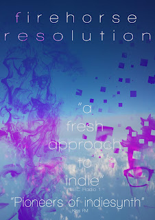
 This is my current magazine advert design. The cover uses the same sky background so it can link to the album cover. It also uses two half cut profile shots of characters with different effects. The character on the left has a smoke effect applied which suggests she is fading away. The character on the bottom left has a pixel effect applied which suggests he is missing parts of his identity. I decided to mix the pixel and smoke effect because they are very different. Smoke is real and natural whereas pixels are computer-made and very modern. The juxtaposition of the primeval smoke and 21st century pixels creates binary opposition between the two characters. This makes the cover appeal more as there is a sense of narrative on just the magazine.
I chose to place the band name towards the top as on the album covers that is where the band name is placed, creating consistency across the print productions. Also, the font is the same to once again create consistency and to create a brand identity.
The use of physical manipulation effects is part of the band's identity and image. On each print production there is an image of a character which has had an effect applied to manipulate and alter reality, creating a much more interesting image unlike most plain indie covers.

This is the inside panel for my album. I merged an image of a water with the character to create the appearance as though he is turning into water to indicate identity is fluid. It is also a reference to the alcohol element of the music video. The pink overlay is used as pink is one of the main colours used across all the album,
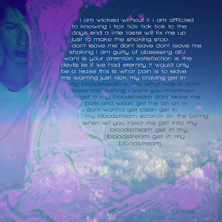
I also placed some of the lyrics on the panel too. The lyrics "get in my bloodstream" as been spaced out with different lines per word. This is done to show the emphasis of the lyrics in the song as each word is stressed. The lyrics are placed behind the water layer as "bloodstream" has obvious connotations of fluidity and therefore makes sense to go behind the water.
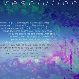
 This is my second inside panel. This features the same character as the first inside panel. This panel uses a smoke effect and it appears as though the character is fading away.
The album name, 'Resolution', is in white in order for the green, when over the white, to create a pink effect. I placed the text behind the smoke layer in order for some pink to be shown.
I also used a white font for the main text, 'resolution' and black for the lyrics. This is the opposite of the font colour on the first inside panel. This is done to create some symmetry and balance between the two panels.


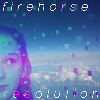
This is my front album cover. Firehorse is in capitals as well as Resolution because it grabs much more attention and it should as it is the front cover and therefore the first impression to the audience.
The pixel background matches the pixel effect on the character on the front. The character also has a gradient applied so that there is a transition between pink and green against the different blues of the background.
The back cover uses the same font as the other panels and has the track list. The panel mimics the motif of the front panel in the pixel idea and the half face.


'Bloodstream' The Final Cut

Wednesday 8 March 2017

Visual Styles

Digipak photos

Figure 1
Some characters below will have a pixel effect where some of their face will be missing and there will be pixels coming off of them (figure 1).
Some other characters will have a water effect where the character appears to have one side of their body turning to water to symbolise alcohol's effect on the body and the perception of your own body.
One of the covers will also have a smokey effect so the character appears to be fading away as smoke, symbolising changing identities. 


Inner panel picture 1
The first photo I am going to use for one of my panels features myself. The character wearing bracers with a plain white top to reflect the preppy character in my music video. The costume is inspired by the 1940s to illustrate the diversity of the indie genre. The covered face is done to link to the theme of fragmented identity. Part of the character's face is covered which shows that the character is trying to cover their face which is how people are identified. This shows that the character is trying to prevent others from knowing
who they are, relating to the fragmented identity theme of the panels and music video.


This cover once again features me but in a different costume. The red baseball shirt is to link to the Americanised sport character in the music video. Baseball shirts are quintessentially American; worn by baseball players. In popular media the baseball shirt is worn by jock character types, linking to our own jock character in the music video.


This photo featuring a girl is simple and innocent. Initially the costume was chosen to portray her as innocent, hence the school lanyard and minimalist makeup. However, in editing I changed my mind and decided to use just the face and decided to edit it in a way to portray her as guilty. By looking away from the camera she appears to have a secret. The pixel effect will then present her as fragmented.
This photo is one I took whilst on a plane in September that I found to fit very well with my theme. The gradient of a dark blue to light cyan is really aesthetically pleasing. The two different views of the atmosphere colliding can act as a metaphor for perspective. The atmosphere is the same however depending on the perspective it seems very different. 
This photo is going to be used as a background for my album panels and magazine.


This next photo is of some orange lilies that had a really nice mix of oranges and greens. The earthy colours made it an option for a background for the album.

Friday 3 March 2017

Audience Profile: Sia

Selecting Actors

Our music feature required a lot of actors which we did not really pay much thought to when planning. To create a believable party atmosphere we would require at least 20 people to have full shots and the likelihood of finding 20 people who were free the same time as my group was very slim. So, we made some alterations of actors. The actors we used were:

Emily- The protagonist. Wearing a large fur coat, Emily was our passive bystander of the partner who shifted room to room observing the chaos.
Bella- The "Mean Girl"- inspired character
Natasha- The artist, inspired by the Chvrches lead singer Lauren Mayberry. This is the character featured in any shots that were in a completely different setting.
Sam- The preppy, nerdy character seen with his partner inspired by the stereotypical preppy fashion. I also played a second role as an athletic character as we had little actors. This character's costume was inspired by college jocks in America; adorning a bomber jacket to mimic the varsity jackets on College campuses.
Georgia- The scene character- initially our goth character, Georgia was cast as a scene kid to be more toned down but a distinctly different personality type.
Jake- Jock 2- Jake played a role of a jock who was in a relationship with the preppy character wearing a simple polo top.

We also had other characters who fulfilled small roles. These include : Megan, Rubi, Alec and Emily. These characters had some distinct styles, most notably Megan as she wore a bright red skirt to play an indie character as well as Rubi who wore double denim to appear indie.

We selected Emily as our main character as Emily already had an effective costume for the character, most notably tall boots. Emily also volunteered to be the protagonist as she was often free for shooting and she could be a most shoots. As she plays the most important character it is only fitting she be available most and Emily was.

Bella played the "Mean Girl" character because the costume was easy for Bella to get and the character was featured often so we could guarantee she would be at the shoot. Although the costume isn't hot pink as the "Mean Girl" outfits are the actual style of a short skirt and colour coherence is still present. The choice of full black was due to the song's dark undertone and black did not suit the theme. We used Bella as our primary negative representation of British youth by encompassing all bad representations of youth in her character. We gave her character a bottle to show she is drinking out of the bottle which is considered reckless and we showed her passed out on the bed. Bella's character is highly chaotic and is therefore our negative representation.

I played two characters as I was at every shoot and we could not find many male actors. I had both costume for the preppy character and the jock character so it was easy to be in the shots needed.

Jake's character was featured a few times playing the preppy character's boyfriend. Jake was the one of three males we could get hold of for the music video. He was a good selection as he was happy to do what ever we needed him to do and helped our shoot happen quicker.

The rest of the characters in our music video were given different styles and personalities but we did not give them their own scene like the main characters. This is because we wanted to have a diverse selection of characters but could not explicitly feature all of them due to time constraint. Also, during our shoot we encountered a few issues so we used some footage from one house and the rest from Natasha's house on a different day. We therefore had a different pool of actors .Rubi for example was only available one day, as was Alec, Jake, Georgia and Emily. Therefore, their characters could not all have their own scenes and were used as background characters. We originally had a large pool of actors however when we got close to shooting our actors dropped out and we were left with a day of shooting where we had to find whoever we could and luckily Emily and Alec were available to film.

Despite the many complications during filming the actors we used did fine and the music video's original ideas, concepts and themes were not altered and our message was conveyed all the same.

Print Production Initial Idea Evalutation

Wednesday 1 March 2017

Question 1: In what ways does your media products use, develop of challenge forms and conventions of real media products? (in progress)

The genre of our music video is a hybrid of indie and synth. Utilising a synth sound and raspy vocals with dark undertones makes the genre stand out against the indie scene. Whilst planning our music video we were very conscious of the conventions of music videos, taking inspiration from "Chvrches'" music videos.

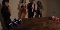
A shot of a few characters and outfits
The narrative structure of our music video is created in order to highlight underage drinking and how easy it is for the youth to acquire alcohol. Some of the characters in the music video are underage and although they are drinking inside a house they were still able to acquire the alcohol.
We included an array of character types formed from the media's stereotypical representation of a culture or clique. In the shot on the right the various outfits and personalities can be seen.

For example we have a jock character, inspired by the plain portrayal of Ryan Shay in the sitcom 'Surbargatory'. The characters are all apart of a smaller narrative within the music video, creating a multi-stranded narrative that interweaves with the other stories. An example of this is the scene of beer-pong where the jock character is present and is then once again seen upstairs with another character who has had their drink spiked. By using many character types we can conform to the indie genre by showing diversity. The indie genre is highly diverse and fights for equality between race, gender, religion and sexuality. We used the other jock character to represent sexuality with the preppy character and they are part of their own narrative where the preppy character becomes annoyed with the jock character as seen in the above photo. This narrative features within the main narrative following the protagonist; creating a multi-stranded narrative that interweaves the smaller narratives. The multi-stranded narrative develops the conventions of diversity within the indie genre.


We also used a cyclic narrative that opens entering the house and finishes by leaving the house. This cyclic narrative is used to show the repetitiveness of house parties. They are all similar and we used this narrative to separate the house party from the rest of the world. It is in its own time and begins as the protagonist enters and finishes when she leaves. This challenges the genre of indie as parties can be mainstream, especially so as our music video is inspired by the film "Project X".


Shows one of the party girls in a full black version of
the "Mean Girls" outfit
The costume in our music video was chosen by researching particular styles, stereotypes and representations of various character clichés. We researched preppy characters in mainstream media and the origin of the style to create a costume which was clearly preppy to illustrate the diverse character types. The stereotypical costume was useful to show the diversity of the music video and we later broke the stereotypes by portraying the jock character as careful and respectful to a girl and showing the preppy character as argumentative. Some of the costume for the female characters is completely black. We had planned to have the characters wear pink as they were inspired by the film "Mean Girls" however we chose to replace the colour with black to reflect the dark undertone of the song. The type of clothing is the same (short skirts for example) but changed the colour.


The party girl character passed out, rejecting the
dominant representation of the party girl type.
The character types we used consist of: preppy nerd, jock, party girl, scene kid, fashion forward girl and an indie-style girl. The variety of characters conforms to the indie genre as it shows diversity however the mix of mainstream characters challenges the genre. In order to stay within the genre of indie we broke the conventions for many of the character types by rebelling against the expected behaviour of the characters. For example,  one of the jock characters is gay which rejects the idea that jocks are always with a girlfriend. This twist breaks the stereotype and conforms to the genre as it is rejecting dominant stereotypes. Also, the party girl character is assumed to party all night however she is seen passed out in a bedroom alone, once again breaking conventions.

Most of the composition of shots we used were thought about thoroughly. We used shallow focus in some shots to show how myopic youths are as they care about the present not the future. This conforms to the indie genre as the genre focuses on having fun at a young age without caring about the consequences. We also use a focus pull of fairy lights to show the change of view in the music video. The change comes during the modulation of the song and it reflects the protagonist's shift in mentality as she wants to leave the party after seeing what is happening.
The shot to the right shows the shallow focus used on the lights, reflecting how youth act myopically.


We cut many of our shots on the beat as well as reversing some shots. The reversing of shots conforms to the indie genre as it is used in other music videos by indie artists such as Alt-J's "Breezeblocks" which is entirely reversed. We also cut back to one of our master shots of the wine bottles frequently as the shot is framed with fairy lights in the back making the shot aesthetically pleasing. The cuts back to this shot reinforce the amount of alcohol consumed and referring back to the main point of our video which is to highlight the danger of underage drinking. We also had performance shots interwoven with the music video which were cut to often. During the modulation of the song there are cuts to the artist on her phone. This is used as a statement to elicit this generation's obsession with phones as it is cut to often during the modulation. The cuts to the shot of the artist on her phone reflects this generation's desensitisation to parties and the events that occur.


In our music video we create representations of gender, age and sexuality.
We present youth as reckless and myopic; unconcerned by the consequences of the present. This is done by using a shallow focus to give the effect that only the closest things are visible. This causes for youths to appear as thought they have no care for the repercussions of their actions and just want to enjoy themselves. The audience are positioned on a young person's side and views the party as she does. However, the protagonist is the only one with a clear view (shown by the sharp focus when she is in the bathroom) which shows her clear state of mind. She is not drunk and can therefore see the dangers of the party. The audience watches the chaos of the party and develops a feeling of fear of young people as they are reckless, creating panic in the audience. This representation is somewhat regressive as it portrays young people as dangerous, reckless and short-sighted however the chaos is being blatantly shown through the protagonist's view.
The representation may seem hyperbolic however it is a very possible reality at parties. In a 2012 study of 1,082 young people 52% said they received an injury whilst drunk and 7% said they needed physiotherapy following a drunken injury. Also, a lot of people do not know the difference between someone passed out and someone who may have alcohol poisoning. These dangers need to be highlighted and in our music video we bring attention to these issues.


An example of where Goodwin's theory can be applied.
The lyrics at this shot are "tick, tick, tick, tick"
Our music video does fit with some of Goodwin's points in his theory of music video. For example, there is a link between the visuals and the lyrics as the lyrics are "tick, tick, tick, tick" and at the same time 4 quick close-ups of a watch are shown. We also show genre characteristics in that the music video is heavily narrative based like most indie music videos.  We also have many close-ups of the artist, a key feature of Goodwin's theory.
Our music video also fits into Todorov's theory of narrative progression. We have an equilibrium of the protagonist passively observing the party which is followed by a disruption in the form of negative scenes such as the couple arguing in the living room. The recognition of the dark undertones of the party are shown when the protagonist discovers blood on her face in the bathroom. At this point there is a modulation to a minor key in the song where the events are reversed and the main character tries to leave the house. The attempt of repair is shown by the reversal; reflecting the main character's desire to reverse time and stop the party happening after seeing the chaos. Lastly, equilibrium is once again achieved once she leaves the party.

Chvrches' album cover. This is what
inspired my print productions immensely.


When creating my print productions I researched a lot of album covers to find a style that I liked and which fitted. I found Chvrches' album cover. The simple pixel effect used was effective and linked to the style of music.

My front cover is clearly inspired by Chvrches and offers a fragmented identity narrative. The pixels coming off of the character leaves her missing parts of her identity. This is done to present youth as an un-finalised self, supporting Bakhtin's idea of the un-finalised self. The pixels in the background of the sky create an unfinished effect too which links directly to the un-finalised self idea as everything is close to completion but is not there yet. The pixels and fragmented imagery of characters is a repeating motif over the 4 album panels and magazine cover as it relates to the indie genre's main themes of self- discovery. The front and back cover were also inspired by Chvrches' music video for Gun. The music video uses lots of glitching effects which I really thought would help convey the genre of our band.
The background over the print productions is the same picture of the sky I took whilst in a plane not too long ago. This picture was ideal as it had a really aesthetically pleasing gradient of of dark blue to white. The basic and simple picture worked out to be very effective.
 The characters used all are blocked to be looking away from the character to show guilt. The looking to the left of the character on the front is done as I want to present her as though she has a secret to create an enigma. In psychology studies when a person lies they look to the left side (the creative side) and can show when person is lying. This therefore presents her as being secretive and creating an enigma.
Initial picture of
character to  album
back

Initial picture of
character to be album
cover.
The lighting in the profile shots all used a flash initially so the image when edited will be clear. The shot needed a strong key light so that the facial features could all be clear.


The composition of the front album cover had the eye level of the character the same height on the cover as the skyline. The white is level with the eye making it more structured. In the magazine advert both characters are present with the text going down the two of them. Also, by using a white font the colour changed when behind a pixel, making the magazine look more interesting.

Editing was very important to achieve my album covers. The pixel effect on the background was created by using a square brush and taking a sample colour of the background and placing a large square there. Some squares I put a gradient on to as well. Each pixel was done individually to ensure the background was not too sporadic. The pixels on the characters was difficult to do initially but once I did a practice picture it was easy. I simply created various layers and masks in Photoshop and began to add pixels to give a pixel explosion effect. The initial idea was to have many pixels but after doing both covers too many pixels made the album art look too clustered and strayed away from the simplicity of the covers. I also applied a colour gradient to the character layers to have them fit with the background. The pixel effect is conceptual and therefore fits the genre conventions of high concept, avant-garde album covers within the indie genre.


This panel features a character wearing a dressed-down preppy outfit. The costume links to the music video as it is showing a character type. Also, the character is wearing a mix of a dark colour (originally black) and bright colour (white). This duality of opposing colours creates juxtaposition which is intended to create a sense of inner-turmoil. The idea of inner-turmoil is key as I want to present identity as more than just fragmented. I want to present identity as something that can be watched as it changes. This perceived identity shift is seen by the pose. The character is watching his hands turn to smoke, showing the change and the character's own observation of himself quite literally fading and changing.
The font used is the same font used throughout the print productions to show cohesion and consistency of the brand.
Also, the physical manipulative effect of the smoke links to the other physical manipulation effects on the other covers. This is because the indie-synth genre has an essence of fantasy due to the distinct synth sounds. Therefore there is a consistent, stylised brand created.


 This inside panel once again utilises a physical manipulation effect where instead of smoke I chose the opposite: water. This will then be opposing the other panel feature smoke. The water and smoke juxtapose each other which once again conveys a sense of juxtaposition. This juxtaposition is used to show the difference between identities within the character (as the character is the same). The duality of effects presents identity as much more tertiary rather than one dimensional.
The water effect is used to present identity as fluid and ever-changing.
The font used is the same once again and it features song lyrics to link to the music video for Bloodstream.

This magazine cover created combines features from two of the album panels. It uses the smoke effect and the pixel effect which creates an interesting dynamic between the medieval connotations of smoke and the modern connotations of pixels, once again indicating duality. The font is placed between each character to create a balance between the two characters.
Both characters are looking away from the character in different directions which suggests secrecy and creates an enigma. Enigma is a key feature of the indie music videos and this use of secrecy mixed with quirky effects fits the genre. I also decided to use the smoke effect to make the hair look like smoke. The smoke stems from the hair and causes the smoke to look like her hair. The exaggeration of this feature fits the genre as indie tends to go against the mainstream so by taking something such a a female's hair which is considered beautiful and making it so exaggerated and bizarre. The result is a puzzling image that is polarising- it can be considered beautiful or ugly but it still draws attention which is the main goal of an advert.